Diagramas de Arquitetura de SOC: Guia de Referência Visual
Os diagramas de arquitetura de um Security Operations Center comunicam relações técnicas complexas — fluxos de dados, integrações de sistemas e cadeias de detecção — que levariam parágrafos para descrever em texto. Para engenheiros de segurança que projetam ou auditam um SOC, essas referências visuais servem como plantas para construir, manter e solucionar problemas da infraestrutura operacional. Este guia apresenta os tipos centrais de diagrama que todo engenheiro de SOC deve conhecer.
A Arquitetura Lógica
O diagrama de arquitetura lógica mostra o fluxo conceitual de dados da coleta até a detecção, a investigação e a resposta. Ele omite nomes específicos de fornecedores em favor de categorias funcionais, tornando-o agnóstico de tecnologia e adaptável a qualquer conjunto de ferramentas. O fluxo de dados padrão de um SOC segue cinco estágios: coleta (sensores e fontes de log), ingestão (normalização e armazenamento), detecção (regras e analytics), investigação (enriquecimento e análise) e resposta (contenção e remediação).
| Estágio | Função | Componentes Típicos |
|---|---|---|
| Coleta | Coleta de telemetria | Agentes, forwarders, API pollers, syslog |
| Ingestão | Parsing, normalização | SIEM, agregador de logs, fila de mensagens |
| Detecção | Geração de alertas | Regras de correlação, modelos de ML, correspondências de TIP |
| Investigação | Enriquecimento de contexto | Consulta de threat intel, DB de ativos, SOAR |
| Resposta | Contenção e correção | Isolamento de EDR, bloqueio de firewall, sistema de tickets |
Diagrama de Fluxo de Dados
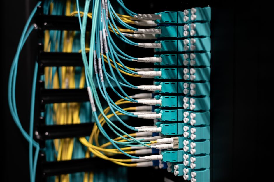
Os diagramas de fluxo de dados mapeiam cada caminho que a telemetria percorre da origem ao destino, incluindo pontos de transformação, locais de armazenamento e endpoints de integração. Os engenheiros usam esses diagramas para identificar lacunas de dados (sistemas que não enviam logs), gargalos (fontes de alto volume sobrecarregando os parsers) e pontos únicos de falha. Um diagrama de fluxo de dados completo cobre dispositivos de rede, endpoints, serviços de nuvem, provedores de identidade, sistemas de e-mail, DNS e qualquer aplicação que gere telemetria relevante para a segurança.
Cada fluxo de dados deve incluir: o sistema de origem, o mecanismo de transporte (syslog, agente, API), o destino (índice do SIEM, data lake), a lógica de parsing (extração de campos, normalização) e a política de retenção. Documentar esses detalhes possibilita um onboarding mais rápido de novas fontes de log e acelera a solução de problemas quando os dados param de fluir.
Diagrama de Topologia de Rede
O diagrama de topologia de rede mostra a posição física e lógica da infraestrutura relacionada ao SOC: servidores de SIEM, consoles de gestão de EDR, plataformas de SOAR, gateways de threat intelligence e sensores de rede. Esse diagrama é crítico para entender o raio de impacto de um componente comprometido e para planejar a redundância.
Os elementos-chave incluem fronteiras de segmentação de rede (onde a rede do SOC se separa da rede corporativa), pontos de inspeção (TAPs, portas SPAN, sensores IDS em linha), planos de gestão (como os administradores acessam as ferramentas do SOC) e caminhos de replicação de dados (como os logs replicam para sites de disaster recovery). A maioria das organizações descobre conexões de rede não documentadas durante os exercícios de topologia — conexões que criam caminhos de ataque não planejados.
Mapa de Cobertura de Detecção
Um mapa de cobertura de detecção sobrepõe o modelo de ameaças da organização às capacidades reais de detecção, normalmente usando o MITRE ATT&CK como framework de referência. Cada célula da matriz representa uma técnica adversária específica (T1059 para execução por linha de comando, T1078 para movimentação lateral, etc.) e é codificada por cores conforme o SOC tenha detecção, detecção parcial ou nenhuma detecção para aquela técnica.
As equipes de segurança usam mapas de cobertura para priorizar o trabalho de engenharia de detecção. As técnicas associadas aos atores de ameaça de maior risco da organização que não apresentam detecção tornam-se as principais prioridades para o desenvolvimento de regras. Com o tempo, o mapa de cobertura deve tender do vermelho (sem detecção) para o verde (detecção testada e validada) nas técnicas mais relevantes para o setor e o perfil de ameaça da organização.
Fluxo de Trabalho de Resposta a Incidentes
O diagrama de fluxo de trabalho de resposta a incidentes documenta o processo passo a passo, do recebimento do alerta até o encerramento do caso. Ele mostra pontos de decisão (critérios de escalada), opções de ação (resposta automatizada vs. manual), atribuições de papéis (quem executa cada etapa) e metas de tempo para cada fase. Esse diagrama serve tanto como ferramenta de treinamento para novos analistas quanto como referência de auditoria de processos para os gerentes de SOC.
Um fluxo de trabalho padrão inclui: triagem de alertas (avaliação inicial em até 15 minutos), investigação (determinação de escopo em até 2 horas), contenção (ação em até 4 horas após o comprometimento confirmado), erradicação (remoção da persistência do ator de ameaça), recuperação (restauração de sistemas e monitoramento) e revisão pós-incidente (lições aprendidas em até 5 dias úteis). As metas de tempo variam conforme o porte da organização e o setor, mas devem existir e ser mensuráveis.
Mapa de Integração de Ferramentas
O mapa de integração documenta cada conexão entre as ferramentas do SOC: SIEM para SOAR, EDR para gestão de casos, TIP para SIEM, sistema de tickets para plataformas de comunicação. Cada conexão mostra o tipo de integração (API, webhook, syslog, banco de dados), a direção dos dados (push/pull/bidirecional) e os dados específicos trocados. Esse mapa é inestimável ao solucionar falhas de integração ou ao planejar substituições de ferramentas — ele revela dependências que um simples inventário de ferramentas não perceberia.